Make Your Social Media Feed Look Professional
An eye-catching social media poster design is the key to stopping users from scrolling past your posts. Whether you are promoting a product, announcing a political event, or sharing daily motivation, your layout needs to look balanced and structured. Here is how you can achieve professional design standards using simple guidelines.
1. Establish a Strong Visual Hierarchy
Your main headline should always be the largest text element on the page. Use bold fonts for your primary hook (e.g., “50% OFF”) and a simpler, cleaner font for secondary details (like dates or addresses). Keep your contact info small but legible at the bottom of the banner.
2. Focus on Contrast and Colors
Never place light text on a light background. Use dark background overlays or choose contrasting colors to make your typography stand out. If your brand uses specific colors, stick to that color palette to maintain a cohesive look.
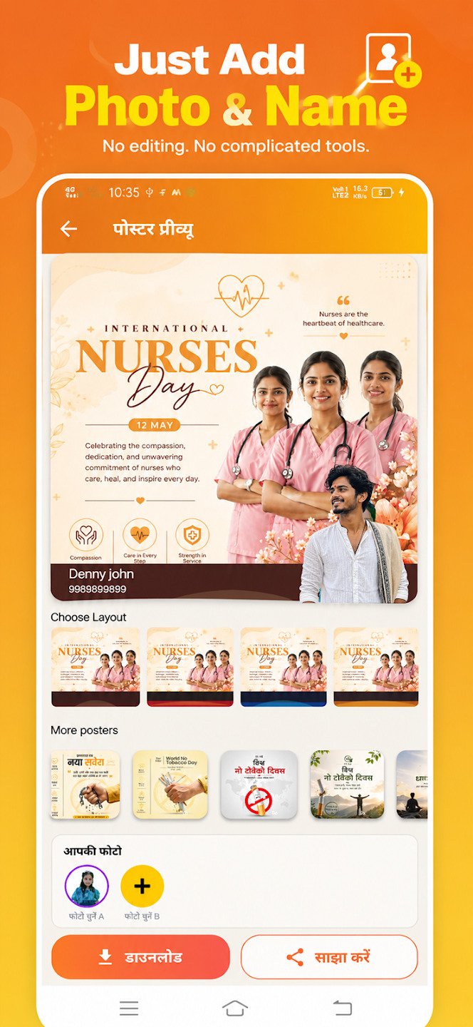
3. Leverage Professional Templates
Instead of starting from a blank canvas, use the pre-built layouts inside Post Sathi. These templates are pre-optimized by expert designers, ensuring correct proportions, stylish fonts, and engaging color palettes right out of the box.